There’s one wall in your living room that’s probably begging for attention and no, it’s not the one with the TV. If your space feels a little unfinished or flat, a gallery wall might be the easiest (and cheapest) way to pull everything together. But the trick? Making it look styled, not just like you randomly stuck up a few prints and hoped for the best.
This guide breaks down exactly how to style a living room gallery wall that looks polished, personal, and yes, totally professional. Whether you’re a minimalist, vintage lover, or all about bold color, there’s a layout and look that’ll work for your space.
From frame choices to foolproof layout tricks, here’s how to turn one wall into a total showstopper without hiring a designer.
1. Pick the Right Wall (and Know Where to Start Measuring)
Start by choosing a wall that naturally draws attention above your sofa, near a fireplace, or behind an accent chair. But here’s where most people go wrong: they start hanging from the ceiling or the edge of furniture without measuring properly.
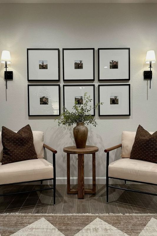
Where to measure from:
-
From the floor: The center of your gallery wall should generally sit around 57 to 60 inches from the floor — standard eye level.
-
From the ceiling: Don’t crowd the top. Leave at least 18 to 24 inches of space to help the layout breathe.
-
Above furniture: When placing art above a sofa or console, aim for 6 to 8 inches of space between the top of the furniture and the bottom of your lowest frame.
2. Define Your Gallery Style Before You Shop
No matter how pretty the prints are, if your wall has no vision, it’ll just feel like clutter. So before you start collecting pieces, decide what kind of vibe you’re going for.
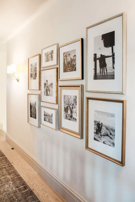
A few gallery wall styles to consider:
-
Modern Minimalist: Black-and-white photos, thin frames, lots of white space.
-
Eclectic: Vintage posters, botanical sketches, hand-drawn portraits — all mixed.
-
Neutral Coastal: Creamy tones, light woods, maybe a watercolor or two.
Having a theme or aesthetic helps narrow your choices and keeps your wall feeling intentional — not random.
3. Choose a Color Palette That Complements Your Room
Your living room already has a color story- your gallery wall should support it, not compete with it. Choose two or three main tones from your space (maybe from your rug, throw pillows, or artwork) and build your wall around those.
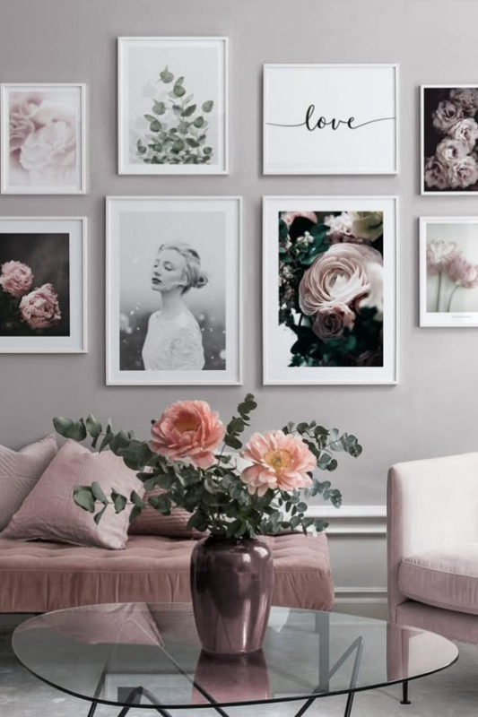
Pro tip: Mix light and dark tones for depth, and don’t be afraid of contrast. A black frame against a white wall? Classic. Soft wood tones on a colored wall? Warm and welcoming.
4. Select the Right Art and Mix Up the Mediums
A gallery wall doesn’t have to be just framed prints. The most stylish ones combine different types of art, think photography, line drawings, graphic prints, or even a shadowbox with a textile or found object inside.
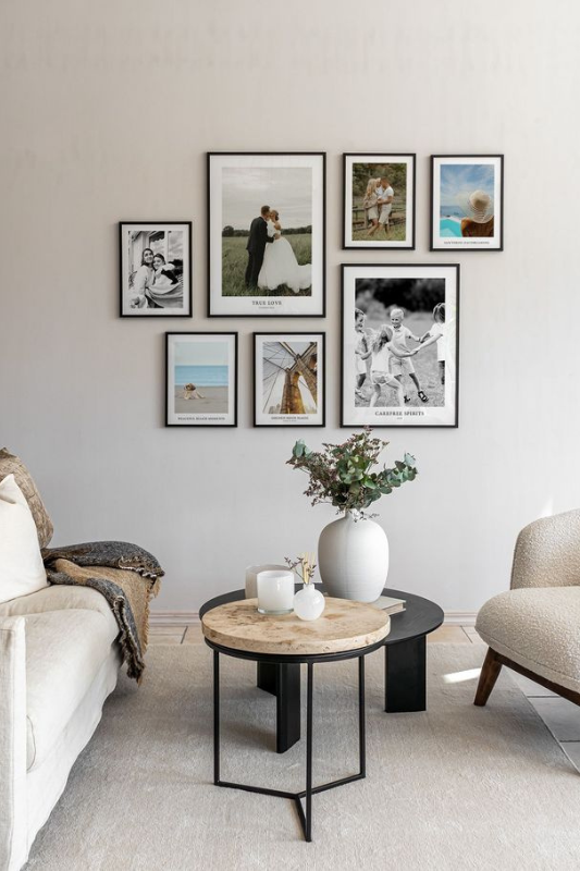
What to include:
-
Family photos (but keep them tonal for cohesion)
-
Abstract or geometric prints
-
Typography or quotes (in small doses)
-
Botanical or nature-inspired art
-
Small mirrors or 3D pieces for texture
The key is to have some consistency , whether it’s color, theme, or framing — so the variety feels curated, not chaotic.
5. Frame It Right
Framing can completely change the tone of your gallery wall. Want a clean, museum feel? Stick to one frame color and thickness across the board. Love a collected-over-time aesthetic? Mix metals, woods, and styles — just keep the size ratio and spacing consistent.
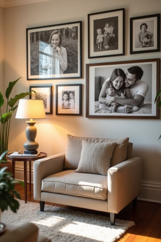
Quick guide:
-
Use thin black or white frames for modern simplicity
-
Try natural wood for warmth and softness
-
Go with metallic finishes for a luxe look
6. Plan Your Layout Before You Hang
This step is absolutely non-negotiable. Don’t eyeball it and hope for the best.
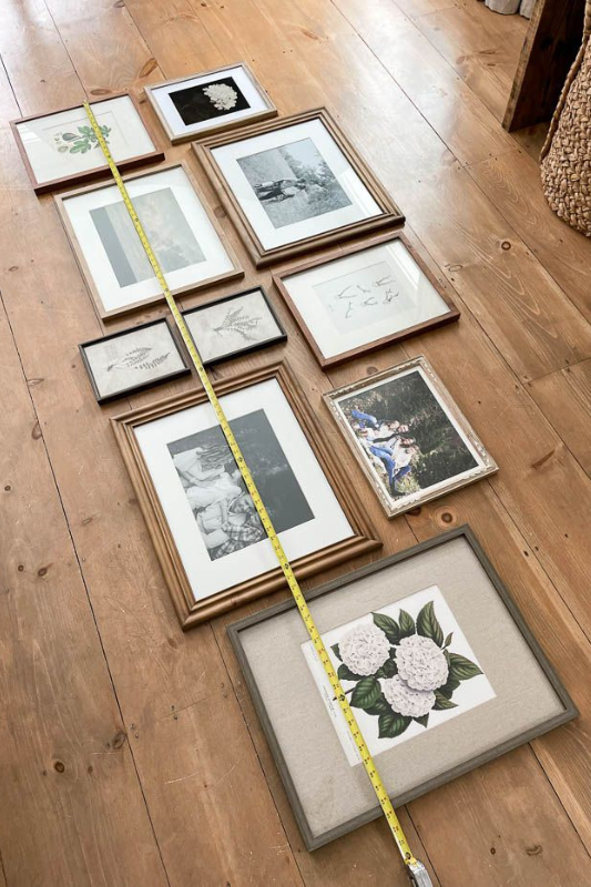
Here’s how to do it right:
-
Lay all your pieces on the floor to test different arrangements
-
Or trace each frame on kraft paper, cut them out, and tape them to the wall using painter’s tape
-
Step back and squint — it helps reveal whether your layout feels balanced
Whether you prefer a grid, a loose salon-style arrangement, or a horizontal line, the key is even spacing (2–3 inches between pieces is the sweet spot).
7. Measure Twice and Hang Smart
This is where precision pays off. Use a level, tape measure, and pencil to mark anchor points. If you’re renting or don’t want to damage walls, use removable picture-hanging strips or hooks that support the weight of your frames.
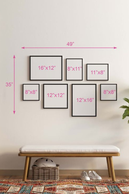
For heavier art or vintage frames, you may need drywall anchors or even a drill. It’s worth taking the time to get this step right — crooked art will distract from all the work you put in.
8. Add a Personal Touch
Want to make your gallery wall feel truly yours? Add something meaningful — a family photo, a travel keepsake, a child’s drawing, or even a piece of fabric that tells a story.
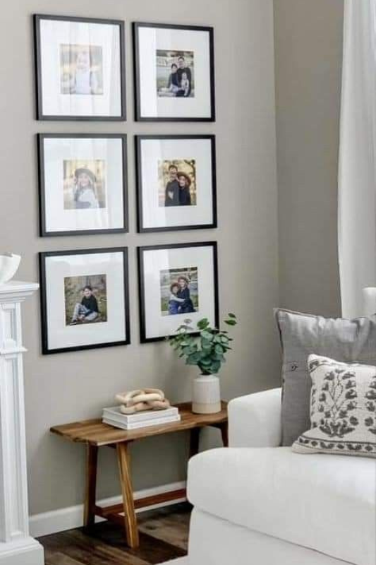
Even just one or two personal elements among store-bought art can completely change the vibe and make the wall feel lived-in and loved.
9. Light It Up
Lighting matters more than people think. If your wall is near natural light, great — just make sure the sun won’t fade delicate prints. If the area tends to be dim, consider adding a wall-mounted picture light, a sconce, or even a battery-powered LED spotlight to highlight your display.

Soft, indirect lighting adds depth and creates an inviting, museum-like glow.
10. Match the Mood of the Room
Your gallery wall shouldn’t feel like it was designed in isolation. It needs to match the mood of your living room and that’s about more than just colors.
If your living space is calm and cozy (think: soft lighting, plush textures, warm woods), your gallery wall should mirror that atmosphere with earthy tones, organic shapes, and relaxed, slightly asymmetrical layouts.
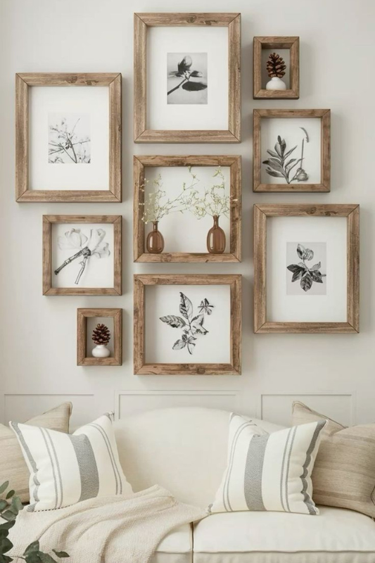
If your room leans modern or formal (sleek furniture, metallics, bold lines), go with sharp frames, symmetrical layouts, and high-contrast art like monochrome photography or architectural sketches.
The mood sets the rules for scale, layout, and even what kind of content belongs on your wall. It’s what turns a collection of pretty prints into a wall that feels truly integrated.
11. Add Texture for a More Layered Look
Flat art is great but your wall doesn’t have to be all paper and glass. Layering in textures brings life, warmth, and a bit of unexpected character.
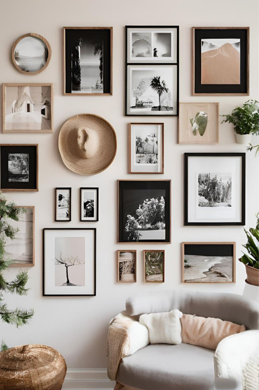
Ideas to try:
-
A woven basket or mini macrame piece framed in shadowbox style
-
A linen-covered corkboard with pinned ephemera
-
Framed pressed flowers or leaves on handmade paper
-
A small wood carving, ceramic tile, or metal object mounted among your frames
These textural pieces break up the visual plane and make your wall feel dimensional, not like a page in a catalog.
12. Anchor Your Wall with One Statement Piece
Every gallery wall needs a “hero”, that one piece that anchors everything else. Choose one larger frame, artwork, or standout image as your centerpiece. Then arrange smaller items around it to support the visual weight. This keeps your gallery from looking scattered and helps the eye rest.
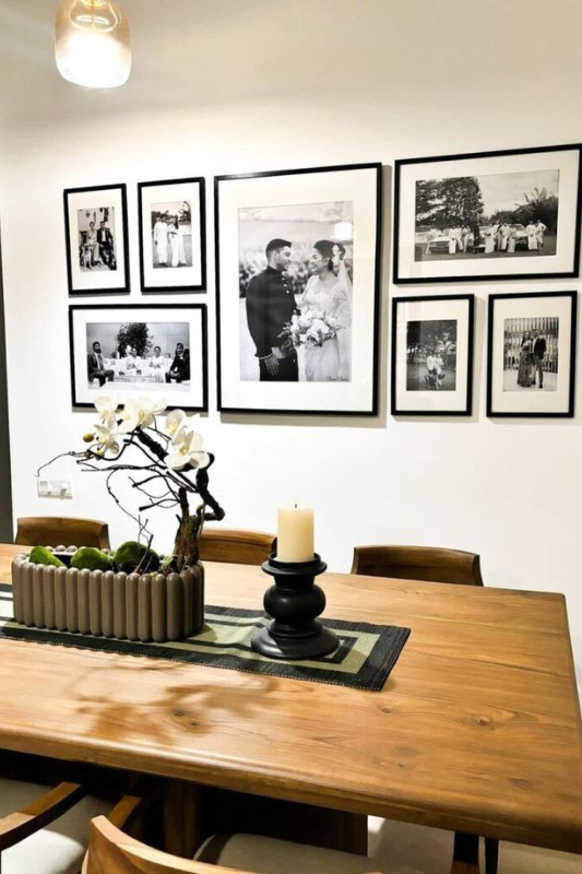
Think of it like composing a song — your statement piece is the chorus, and everything else is background harmony. It doesn’t have to be the most expensive piece on the wall, just the most eye-catching. Maybe it’s a large abstract painting, a bold black-and-white photo, or a print with deep, saturated color that stands out from the rest.
Where to place it:
-
Slightly off-center works well — it feels balanced but not too perfect
-
Align it with the centerline of your sofa or console to visually ground the space
-
If you’re working with a grid layout, make sure it draws the eye with scale or contrast
From there, build outward with mid-sized and small frames to create rhythm and flow. This “anchor and orbit” method works especially well if you’re working with varied frame sizes or styles — it gives structure without looking stiff.
If your wall feels chaotic, chances are it’s missing this single focal point.
13. Create a Moodboard Before You Hang Anything
Even the pros don’t wing it — and you shouldn’t either. Creating a moodboard (digitally in apps like Canva, Milanote, or even Pinterest, or physically on the floor) lets you play with colors, textures, and layout before committing.
Snap pics of your framed pieces and test different groupings on screen. Move things around until the combination clicks, visually and emotionally.
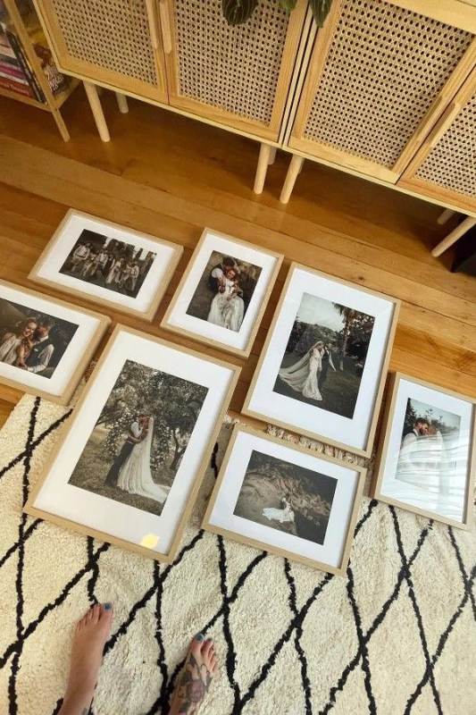
Want to test your layout on the wall? Cut paper templates the size of your frames and tape them up in place to preview spacing and arrangement. This takes time, yes, but it saves wall damage, second-guessing, and a lopsided final look.
Once everything’s up, take a breath and a few steps back. Look at your wall from different angles and see how it feels in the space. Don’t be afraid to swap one piece out, shift something slightly, or even remove a frame if it throws off the balance. Design is meant to evolve and sometimes, less really is more.
Common Gallery Wall Mistakes to Avoid
Here’s where even stylish decorators can stumble. Avoid these common mistakes if you want your gallery wall to look curated — not chaotic:
-
Hanging artwork too high or too low: Keep the center at eye level, and allow 6–8 inches above furniture.
-
Spacing inconsistently: Uneven gaps between frames can ruin the whole look. Use a spacer (or a ruler!) and keep it consistent.
-
Using too many colors or styles: Variety is great, but if nothing ties the pieces together (color, theme, or frame), it gets messy fast.
-
Neglecting lighting: Great art in a dark corner is just… sad. Add a picture light or sconce if the space needs it.
-
Skipping the plan: Don’t wing it. Sketch it, map it, or lay it out on the floor first.
Here’s the best part: gallery walls don’t have to be perfect, and they don’t have to be permanent.
Your living room is a living space, so let your gallery grow, shift, or simplify as your tastes change. Maybe you add a new print from your travels, swap out a photo for a more seasonal one, or gradually expand the layout as your art collection grows.
Give yourself permission to experiment and adjust. That flexibility is what makes gallery walls so beloved, they’re personal, they’re expressive, and they grow with you.
